
What are operational dashboards, and why do they matter?
Operational dashboards are real-time visual tools that track daily KPIs and process health so frontline teams can spot deviations and act before problems compound. They are not reports. They do not answer "what happened last quarter?" They answer "what needs to happen right now?"
The distinction from executive dashboards is fundamental. Executive dashboards aggregate strategic KPIs on weekly or monthly cycles for senior decision-makers. Operational dashboards refresh continuously, or near-continuously, and serve the people closest to the work: shift leads, operations managers, customer success teams, and department heads who need to act within hours, not weeks.
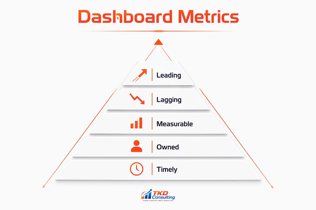
Three practical benefits drive adoption. First, deviations become visible before they reach the income statement. Second, accountability sharpens because every metric has a named owner. Third, weekly reviews replace firefighting with a structured rhythm. The MOTA framework (Measurable, Owned, Timely, Actionable) is the most widely used filter for deciding which metrics belong on a dashboard versus which belong in a report.
A well-designed performance dashboard should be readable in under three minutes. If it takes longer, it has too many metrics.
How do operational dashboards differ from other dashboard types?
Not all dashboards serve the same purpose, and mixing types typically weakens both.
Operational dashboards focus on transactional, process-level data updated daily or in near-real-time. Their audience is broad: anyone in a department who needs to direct their work priorities based on current state. Operational dashboards require departmental-wide visibility to align team priorities daily.

Executive dashboards are narrowly tailored, often for one or two decision-makers, covering aggregated strategic KPIs on weekly or monthly cycles. They answer questions about direction, not execution.
Analytical dashboards support deep-dive trend discovery and historical analysis. They are built for data analysts and strategists, not for operators who need to act this shift.
Key differences at a glance:
- Update frequency: Operational (real-time to daily) vs. executive (weekly/monthly) vs. analytical (on-demand)
- Audience: Operational (department-wide) vs. executive (C-suite, narrow) vs. analytical (data teams)
- Primary question: Operational ("what needs to happen now?") vs. executive ("are we on strategy?") vs. analytical ("why did this trend occur?")
- Metric type: Operational (process KPIs, activity metrics) vs. executive (aggregated outcomes) vs. analytical (historical patterns, cohorts)
Building one tool to serve all three purposes almost always fails all three purposes.
Which metrics belong on an operational dashboard?
Effective operational dashboards carry multiple metrics organized across several sections. Too few metrics creates blind spots; too many creates noise. The right ratio favors about 60% leading metrics to 40% lagging metrics. Leading metrics predict what will happen; lagging metrics confirm what already did.
| Section | Example Metrics | Update Frequency | Owner |
|---|---|---|---|
| Revenue Health | ARR, pipeline coverage, net revenue retention | Daily/Weekly | CRO / VP Sales |
| Cost and Margin | Gross margin, operating expense ratio, burn rate | Weekly | CFO / Finance |
| Customer Operations | NPS trend, ticket resolution time, onboarding completion | Daily | VP Customer Success |
| Go-to-Market Efficiency | CAC by channel, time to close, quota attainment | Weekly | Sales Ops |
| People and Capacity | Headcount vs. plan, revenue per FTE, open role age | Weekly | COO / HR |
Leading metrics like pipeline coverage and sales pipeline velocity give you a chance to intervene. Lagging metrics like revenue and churn tell you whether the interventions worked.
Apply the MOTA filter before adding any metric. Measurable means it pulls from source systems without manual calculation. Owned means one person explains variance. Timely means it updates fast enough to catch problems early. Actionable means a decision made this week can actually move it. Any metric that fails one of those four tests belongs in a report, not on the dashboard.
How do you design an operational dashboard that people actually use?
Most dashboards fail at adoption, not at technology. The design choices that separate used dashboards from ignored ones are straightforward.
Limit the metric count. Metric bloat is the primary cause of dashboard failure. A dashboard readable in under three minutes forces the discipline of choosing only what drives decisions.
Use exception-first design. Color-coded thresholds (green for on-plan, yellow for watch, red for intervene) let operators find problems without scanning every number. This is not cosmetic. It is the mechanism that makes a dashboard faster than a report.

Build a decision-driven structure. Every section maps to a specific decision domain. Revenue health drives forecasting and hiring calls. Margin metrics drive pricing decisions. If a section does not map to an identifiable decision, it belongs in a report.
Unify your data. Dashboards are only as good as the data behind them. A unified namespace and consistent tag model across systems prevents the "which number is right?" problem that kills trust in any dashboard.
Assign role-based views. Operators see shift-level alarms and process metrics. Maintenance sees asset states and MTTR. Leadership sees aggregated KPIs across sites. Same underlying data, different lenses.
Pro Tip: Before your next dashboard review, run every metric through MOTA. Any metric that lacks a clear owner or cannot be influenced by a decision this week should be removed immediately.
Change management matters as much as design. A dashboard nobody reviews on a weekly cadence is just a screen. Build the operational rhythm first: a 30–45 minute weekly review where every red and yellow metric gets an owner and a clear next action.
Which operational dashboard tools are worth considering in the US?
Three providers cover meaningfully different use cases for US operations teams.
| Provider | Key Features | Primary Use Case | Deployment | Pricing Model | AI Capabilities | Rating |
|---|---|---|---|---|---|---|
| Domo, Inc | AI agents, 1,000+ data source integrations, workflow automation, BI visualization | Enterprise-wide business intelligence and real-time monitoring | Cloud | Tiered (not publicly listed) | AI-powered agents, automated workflows | 4.1★ (80 reviews) |
| Dashboard Builder | Drag-and-drop layout, AI Smart Query, SQL builder, PHP embedding, HTML export | No-code real-time dashboards with AI-assisted querying | Cloud, on-premises, Windows desktop | Free download; paid cloud/online plans | AI Smart Query (natural language) | 3.8★ (5 reviews) |
| dashboardSMASHBOARD | Goal-first analytics, live KPI arcs, OKR framework, custom metric goals, alerts | Shopify ecommerce tracking with live forecasting | Cloud (Shopify app) | Not publicly listed | Live forecasting, goal automation | — |
Domo, Inc is the enterprise choice when data integration breadth matters. Connecting over 1,000 data sources into a single governed environment, with AI agents that answer operational questions on demand, it earned Dresner Advisory Services Technology Innovation Awards recognition in 2025. The platform suits organizations that need cross-functional visibility at scale.
Dashboard Builder takes a different approach. Its AI Smart Query lets users ask questions in plain English and get dashboard results without writing SQL, though SQL power is available for those who want it. The free download and multiple deployment options (cloud, on-premises, Windows desktop installer, with version 7.6 released in July 2026) make it accessible for teams that need flexibility without a large procurement cycle.
dashboardSMASHBOARD is purpose-built for Shopify founders and growth teams. It bakes OKR methodology directly into the dashboard, so every metric ties to a goal rather than sitting as a passive number. For ecommerce operations teams tracking live revenue against targets, that goal-first framing changes how the team uses the data.
What TKD Consulting sees in the field on dashboard effectiveness
David Karpatkin, founder of TKD Consulting and holder of an MBA in Global Leadership from UT Dallas, has run warehouse operations, home services, and consumer products organizations where dashboard failures had real consequences: missed shipments, margin compression, and teams that were busy but not aligned.
The most common pitfalls TKD Consulting identifies in mid-market operations:
- Metric overload: Teams add metrics without removing any, until the dashboard requires a 20-minute scan to find the one number that matters.
- Siloed data: Finance, sales, and operations each maintain their own numbers, so the dashboard shows three different revenue figures depending on who built it.
- No ownership: Metrics without named owners generate discussion but not decisions.
- Wrong cadence: Monthly reviews of a weekly-update dashboard mean problems are already embedded in the financials before anyone acts.
A measurement culture that treats the dashboard as a decision tool rather than a reporting artifact is what separates operators who get ahead of problems from those who react to them. TKD's approach pairs dashboard design with the meeting cadences and accountability frameworks that keep the data connected to action. For mid-market industrial and B2B services companies, that implementation runway is often what the tool vendors do not provide.
What makes dashboard implementation fail, and how do you fix it?
The technology is rarely the obstacle. Implementation stalls on three predictable problems.
Data trust breaks adoption. When teams see conflicting numbers across systems, they stop using the dashboard and revert to spreadsheets. The fix is a single source of truth established before the dashboard goes live, not after. Agree on definitions (what counts as a closed deal, what counts as a resolved ticket) and document them.
No executive sponsorship. Dashboards that leadership never references in meetings signal to the team that the data does not drive decisions. The weekly review cadence must be modeled from the top. Without it, adoption erodes within 60 days.
Scope creep during build. Every stakeholder adds "just one more metric" until the dashboard fails the three-minute readability test. Enforce the MOTA filter during the build phase, not after launch. Understanding why execution fails often starts with this exact pattern.
How do operational dashboards connect to your existing IT systems?
Integration is where most dashboard projects underestimate the work. A performance dashboard pulling from five disconnected systems without a unified data model will show five versions of the truth.
The most reliable architecture uses a unified namespace (UNS) where all devices, applications, and data sources publish to a common structure. Proxus, for example, unifies plant data with a consistent tag model and queries ClickHouse on a schedule for low-latency views. The principle applies beyond manufacturing: any dashboard that spans CRM, ERP, support ticketing, and finance needs a single normalized data layer underneath.
For cloud-based business intelligence, Domo's 1,000+ connector library handles the integration layer for most enterprise stacks. Dashboard Builder supports multiple data source connectivity with SQL-level control for teams that need custom joins across systems.
How does real-time data actually reach a dashboard?
Three methods cover most operational use cases.
Scheduled refresh queries the data source on a configured interval (every 5 minutes, every hour). It works for most operational metrics and keeps database load predictable.
Live stream bindings push data continuously for near-real-time needs, such as active alarm states, live order counts, or floor-level sensor readings. The tradeoff is higher infrastructure load.
Push alerts notify teams automatically when a threshold is breached, without requiring anyone to check the dashboard. For critical operational issues, push alerts outperform pull-based monitoring because the signal reaches the operator immediately.
The right method depends on the metric. Pipeline coverage can refresh hourly. An active equipment alarm needs a live stream. Knowing which metrics need which refresh rate is a design decision, not a default setting.
How do you measure the ROI of an operational dashboard?
ROI from a performance dashboard shows up in three places: faster issue resolution, reduced waste from better-informed decisions, and time recovered from manual reporting.
The clearest measurement approach is before-and-after on a specific operational metric the dashboard was built to improve. If ticket resolution time was the target metric, measure it at 30, 60, and 90 days post-launch. If pipeline coverage was the focus, track forecast accuracy over the same period.
Time savings from eliminating manual reporting are often the fastest-to-quantify win. Teams that previously spent hours each week assembling data for a Monday review meeting recover that time immediately when the dashboard automates the assembly. Pair that with operations consulting guidance on which metrics to prioritize, and the ROI case becomes concrete rather than theoretical.
The harder ROI to quantify, but often the largest, is the cost of problems caught early versus problems caught after they hit the income statement. A margin compression caught at week two costs a pricing conversation. Caught at month four, it costs a restructuring.
Key Takeaways
Operational dashboards drive real results only when metric selection, data integration, and review cadence are treated as equally important as the tool itself.
| Point | Details |
|---|---|
| Lead with leading metrics | Maintain approximately a 60% leading to 40% lagging metric ratio to stay ahead of problems. |
| Apply MOTA before adding metrics | Every metric must be Measurable, Owned, Timely, and Actionable or it belongs in a report. |
| Three-minute readability test | A dashboard that takes longer than three minutes to read has too many metrics. |
| Match the tool to the use case | Domo suits enterprise data integration; Dashboard Builder fits no-code flexibility; dashboardSMASHBOARD targets Shopify teams. |
| TKD Consulting for implementation | TKD Consulting pairs dashboard design with accountability frameworks and meeting cadences for mid-market operators. |
TKD Consulting helps you turn dashboard data into decisions
The tools above give you the screen. TKD Consulting gives you what comes after: the metric definitions, ownership assignments, review cadences, and accountability structures that make the data drive actual decisions instead of sitting on a monitor.
David Karpatkin has personally run the operations these dashboards are supposed to monitor, from distribution centers to home services to consumer products. TKD's Operations Audit maps your current performance systems against your stated goals, identifies the metrics that actually matter for your business, and delivers a 60-day action plan your team can execute starting Monday. No slide deck. No six-month engagement. Just a clear picture of where you are, where you need to be, and exactly how to close the gap. If your dashboard is showing you data but not driving decisions, book a discovery call and find out what is missing.